SamoPride
SaMo PRIDE is a joint efford with Santa Monica Pier, Downtown Santa
Monica, Santa Monica Place, City of Santa Monica and Santa Monica Travel and Tourism, to celebrate the city’s inclusive and diverse LGBTQIA+ community.
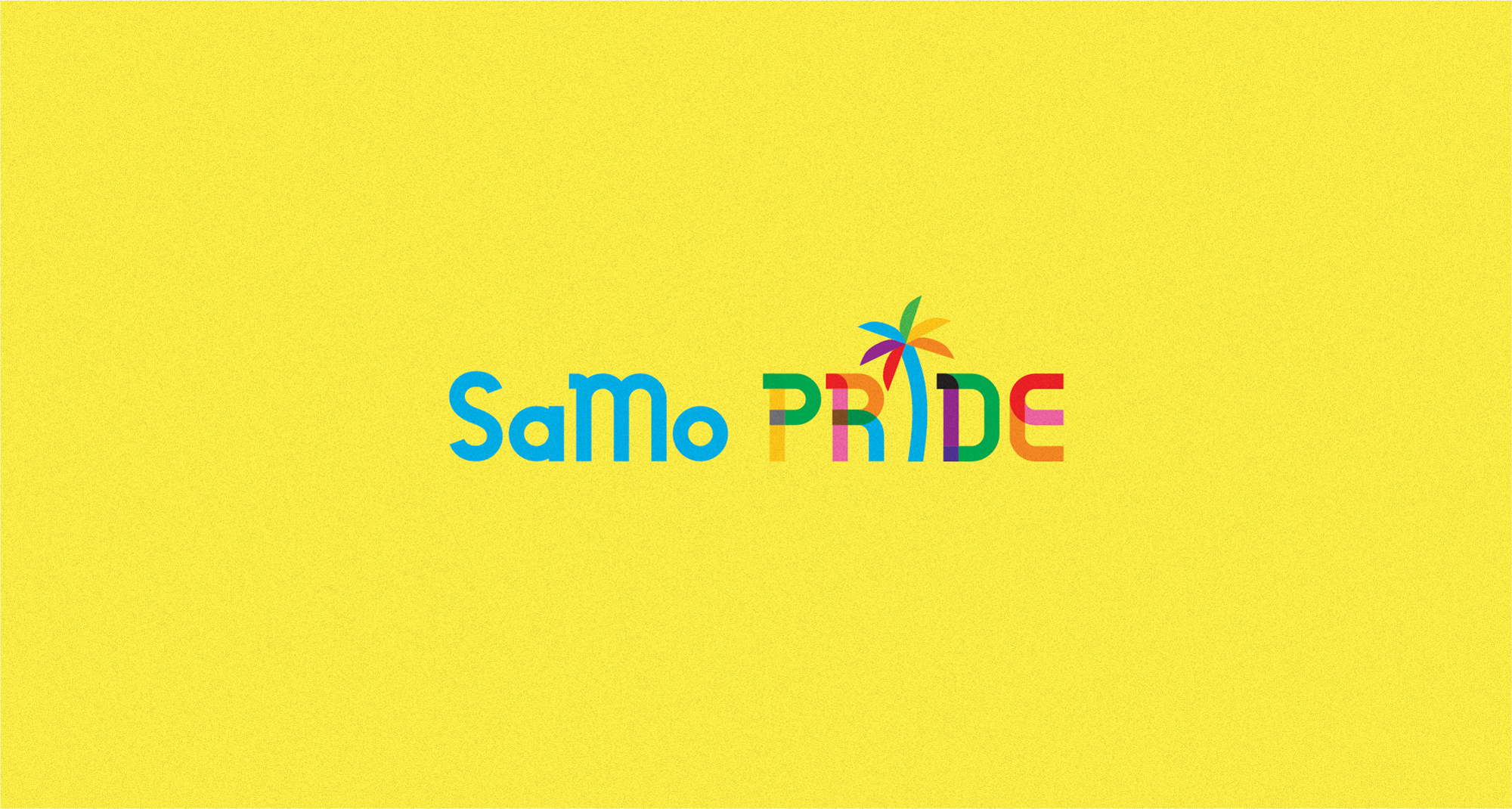
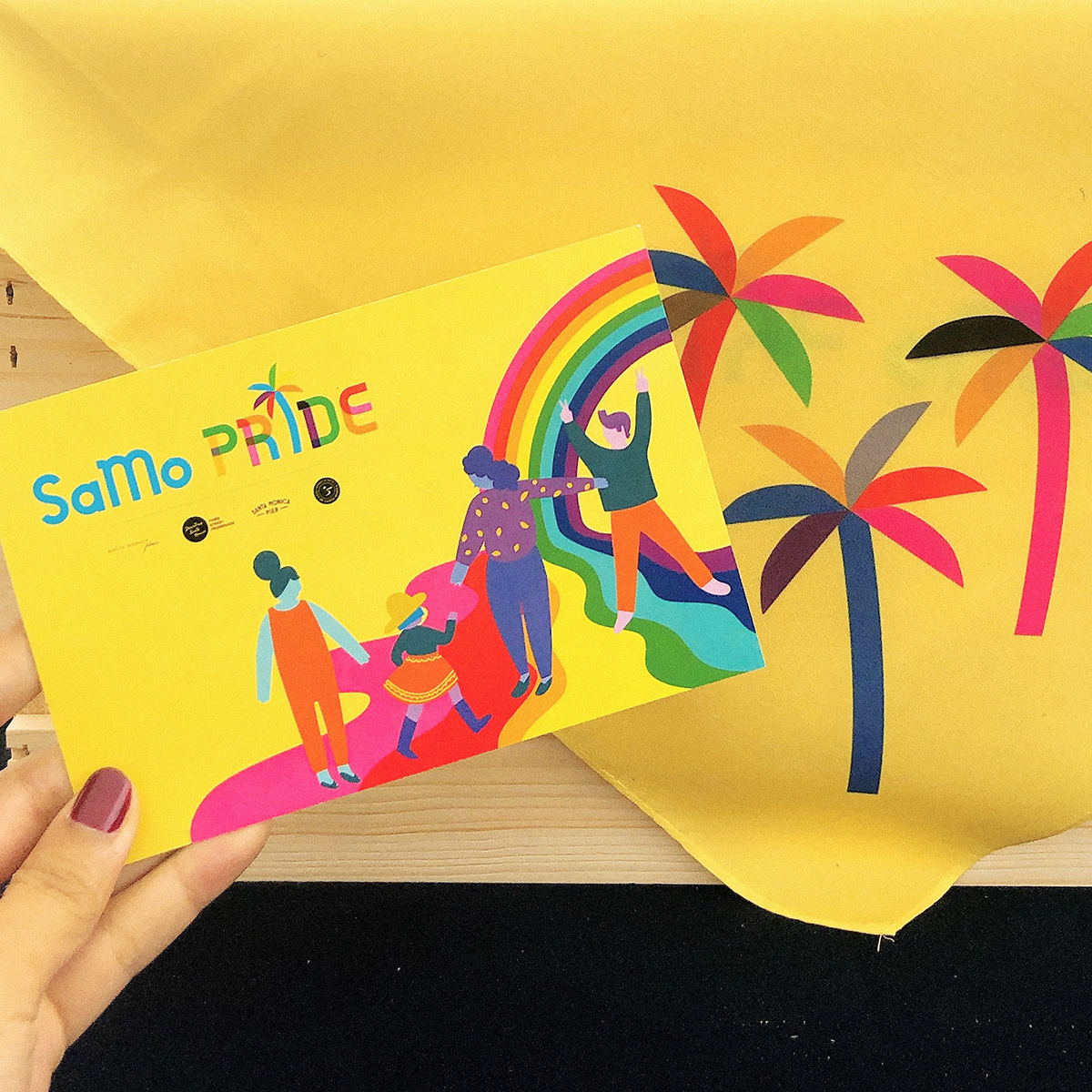
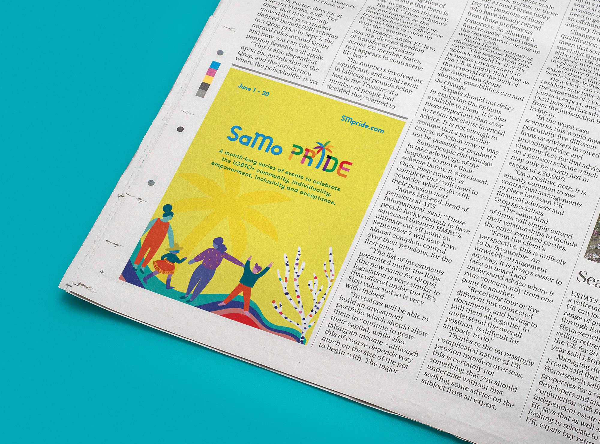
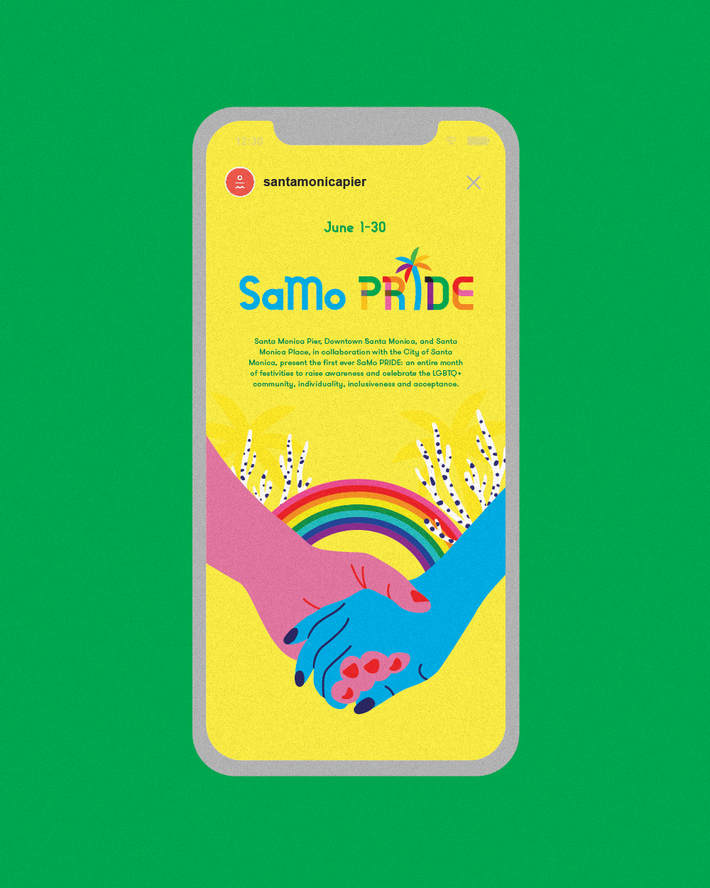
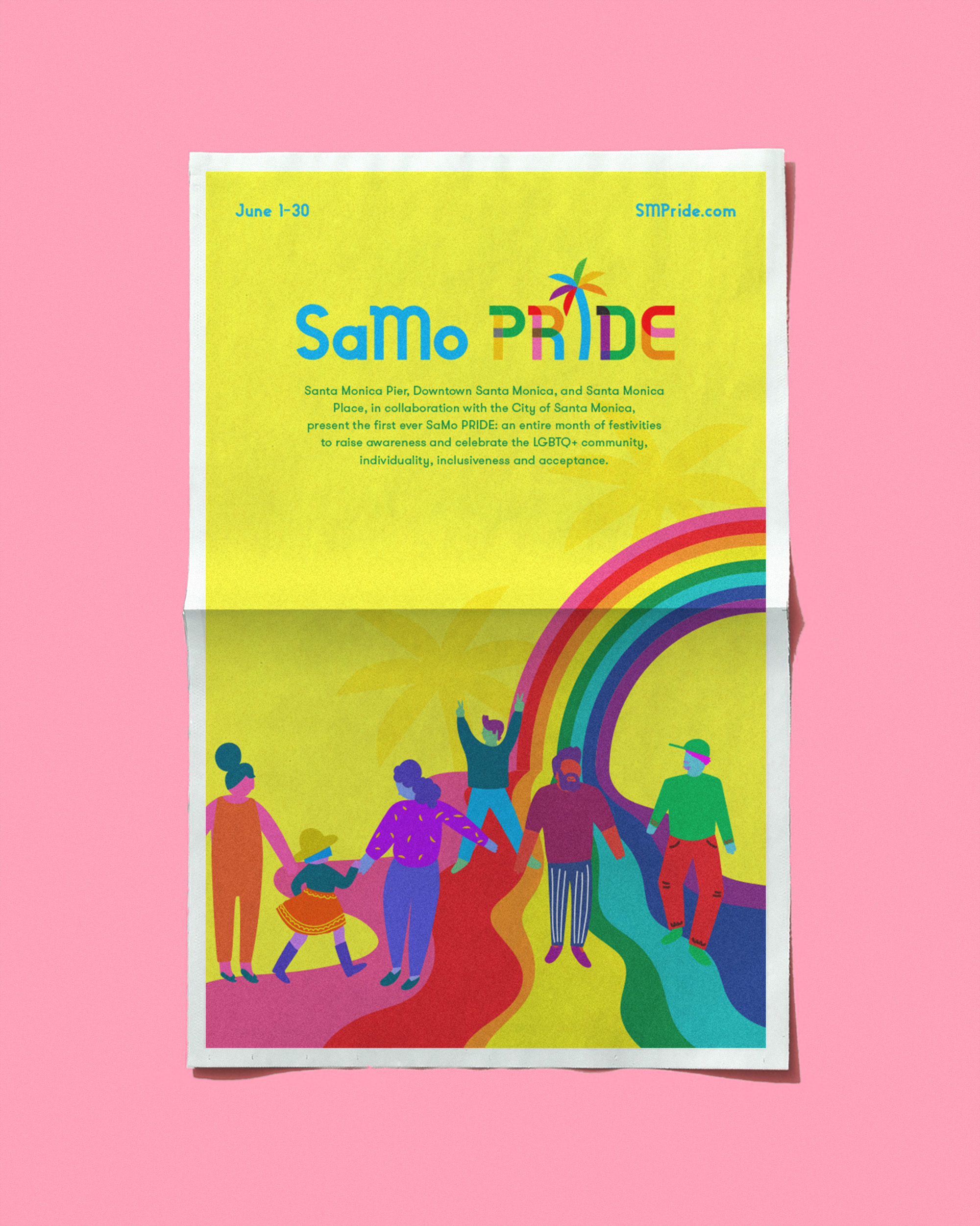
In developing the visual language for the brand, we incorporated vibrant illustrations that celebrate the diverse and colorful community. The logo itself was carefully considered and designed using the typeface Gilbert as the foundation, followed by a custom palm tree that ties the overall logo back to this seaside City... And of course, a straight Palm tree wouldn’t make sense would it? We had to add a slight wink.
In developing the visual language for the brand, we incorporated vibrant illustrations that celebrate the diverse and colorful community. The logo itself was carefully considered and designed using the typeface Gilbert as the foundation, followed by a custom palm tree that ties the overall logo back to this seaside City... And of course, a straight Palm tree wouldn’t make sense would it? We had to add a slight wink.
BBB Bus Wrap
![]()
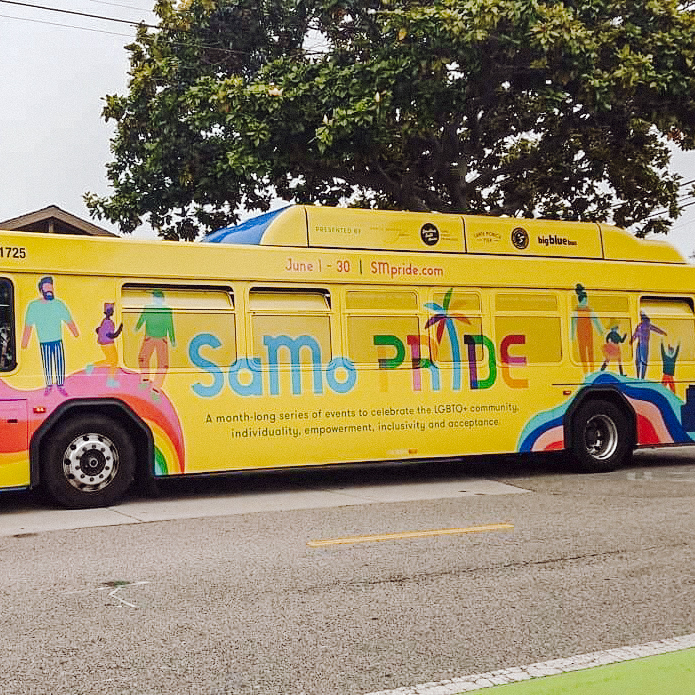
SM Free Rides
![]()

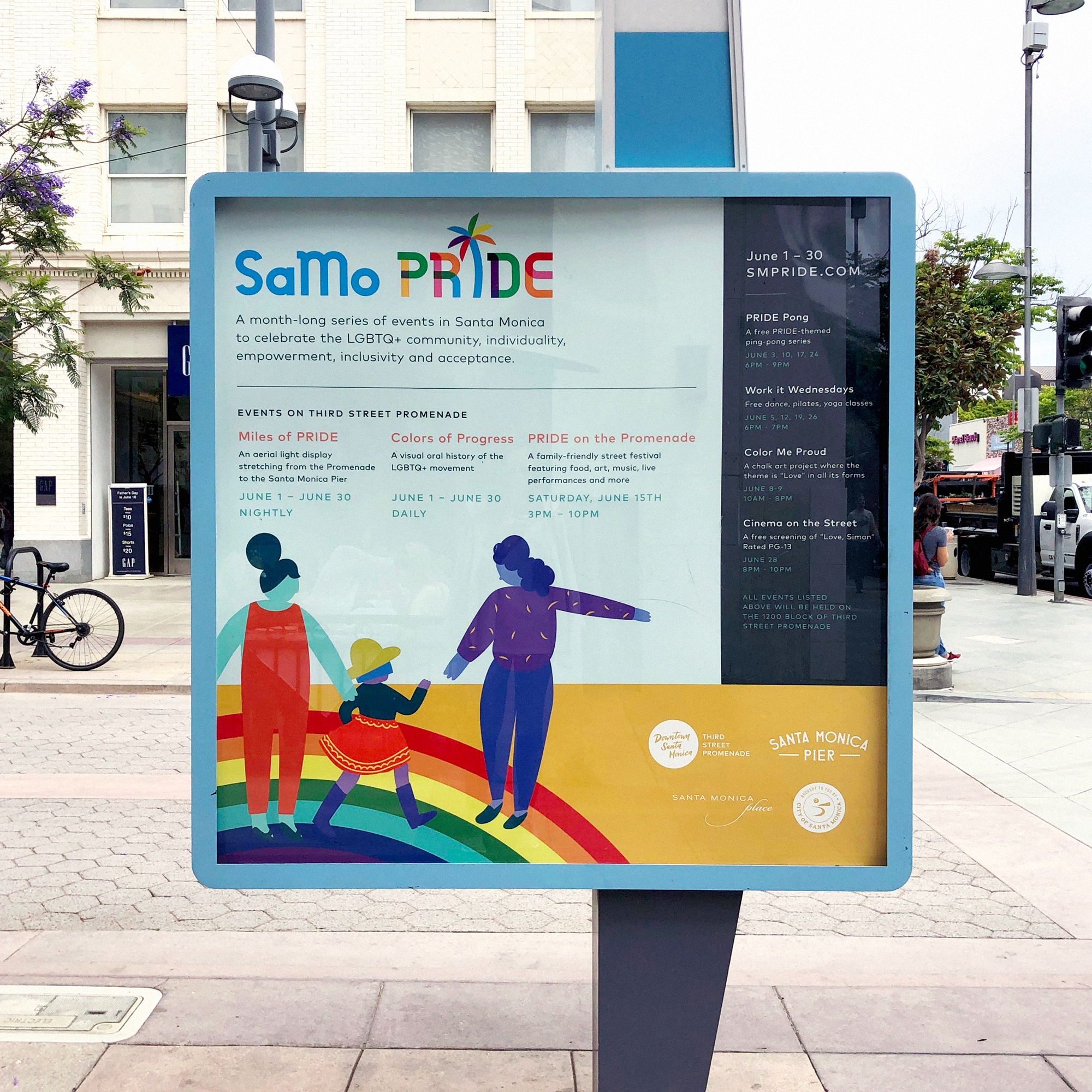
3rd Street Promenade Kiosks
![]()
Custom Bandanas
![]()

— Santa Monica City Hall

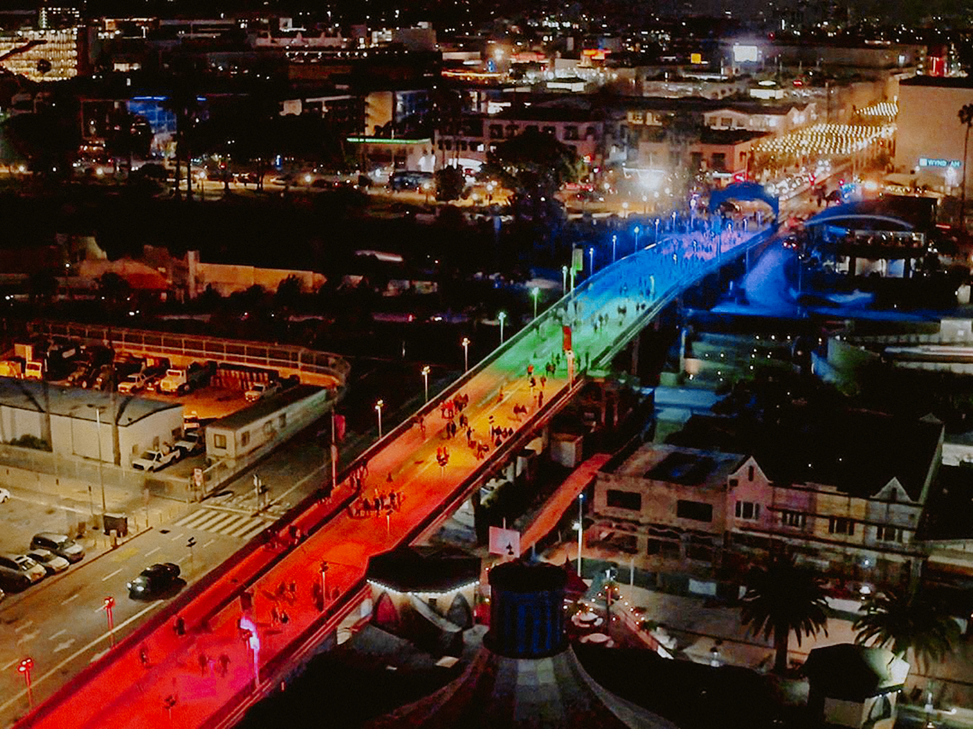
— Santa Monica Pier Bridge

SamoPRIDE’stypeface is derived from Gilbert. Read more about the incredble initiative here
